Chandigarh University Lucknow
The new website for Chandigarh University’s Lucknow campus: 900+ pages from 19 layouts, sized for a million visitors a month. I led it from a Day 0 draft to handover, with a team of five.
- Client
- Chandigarh University, Uttar Pradesh
- Year
- 2026
- Role
- Team Lead, Product Design Engineer
- Services
- Product Design, Design System, Information Architecture, Frontend Development, Team Lead, Stakeholder Management
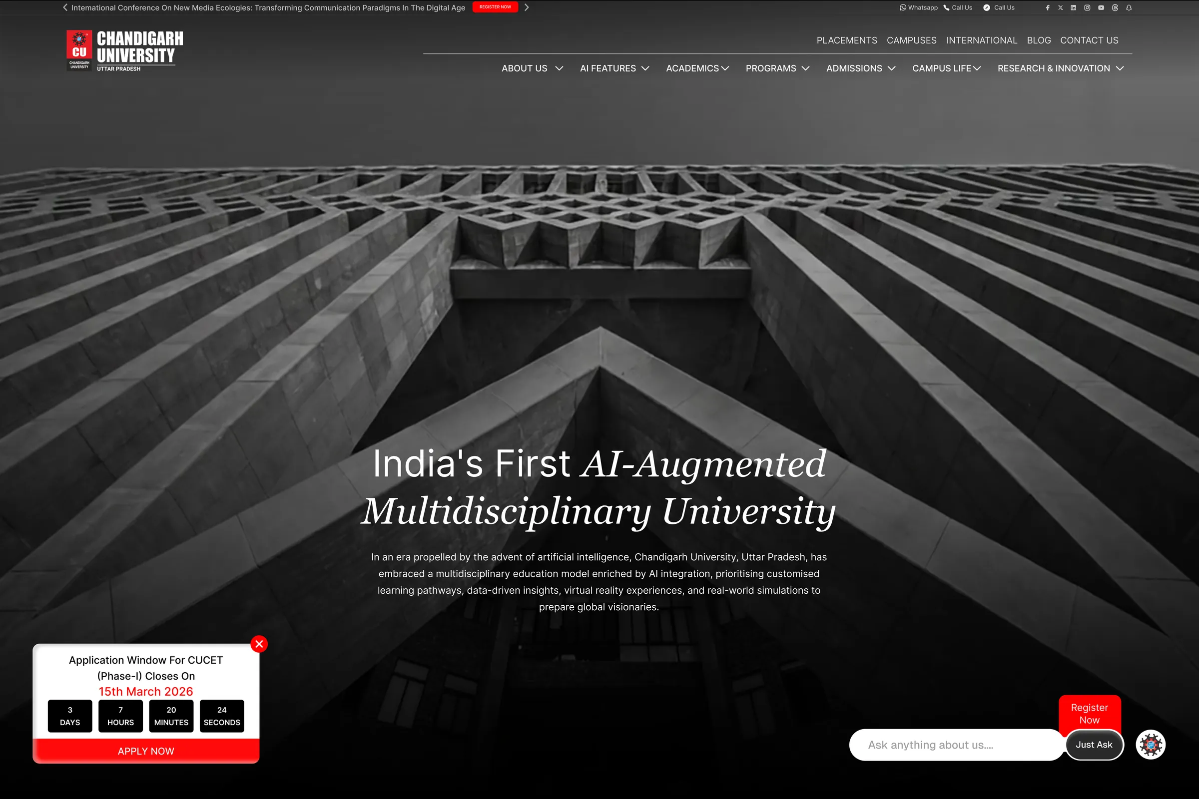
Chandigarh University opened its Uttar Pradesh campus in Lucknow in 2024, and its website was still a PHP build with no CMS, no automation and ten-year-old architecture. The brief asked for everything at once: modern and clear to every age group, easy to run, fast, good for search, AI-ready, on-brand, and better at bringing in registrations.
I led the project from the first draft to handover: the design, the design system, the architecture and stack, a team of five, and every review with the university’s management. When a section was faster to build than to explain, I built it.
The brief
Serious, but for everyone
Private university sites in India are advertisements: banners, pop-ups and Apply Now in every corner. It works, and a new site could not cost the university a single registration. But the same site had to reach a student who knows the web, a parent who knows the basics, and a family visiting a university site for the first time. Clutter loses the last group; bare minimalism loses them too.
Day 0
A whole draft before the first meeting
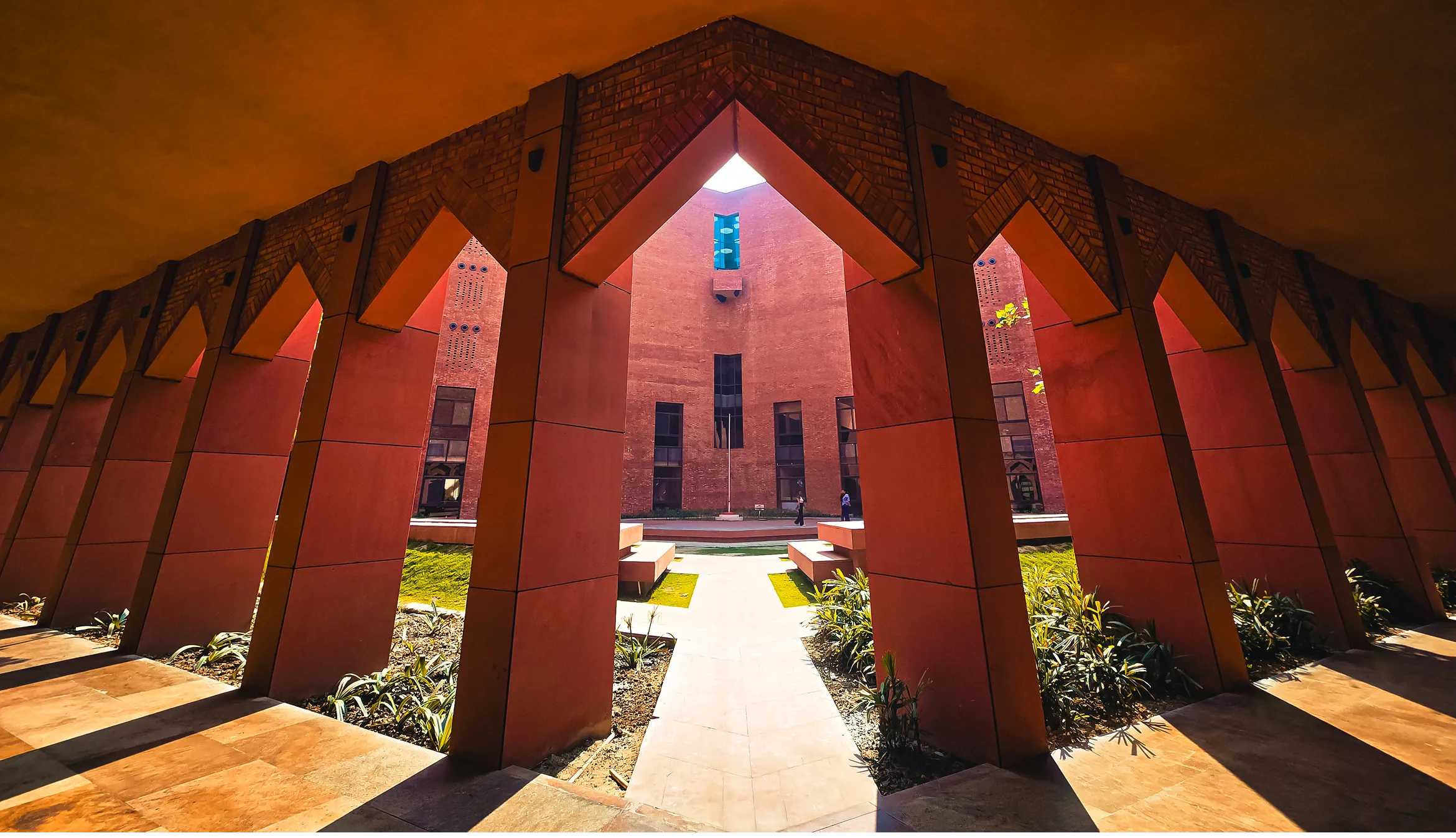
A university moves through layers of approval, and waiting on each layer would have spent the six months before anything was drawn. So before day one I designed the whole landing page in twelve hours: fifteen sections, from the hero to the footer, with campus photos I found on the university’s Instagram. I expected it to be rejected. It was meant to start the conversation. The chancellor approved it.
Fifteen sections in twelve hours.
The system
A grid that says serious
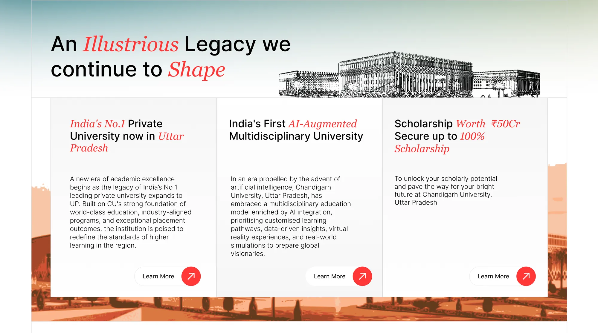
The old site’s content floated wherever it landed. I put every piece in a box on a strict grid of lines: it contains the content, ranks it, and reads as discipline, which suits an institution. It also meant each new section was a new arrangement of the same grid, not a new design. Seven days later there was a design system, a wireframe and an architecture for the build.
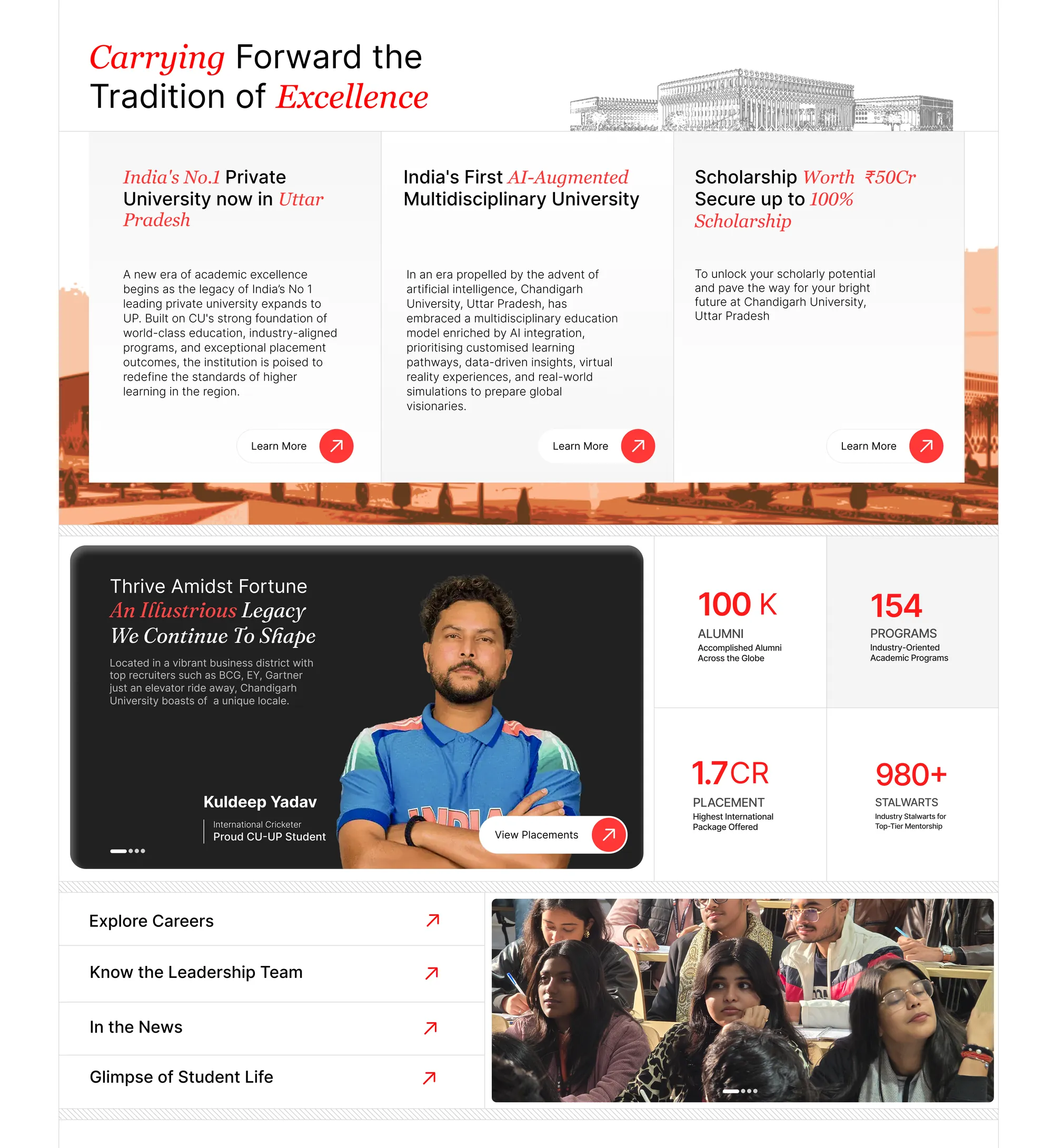
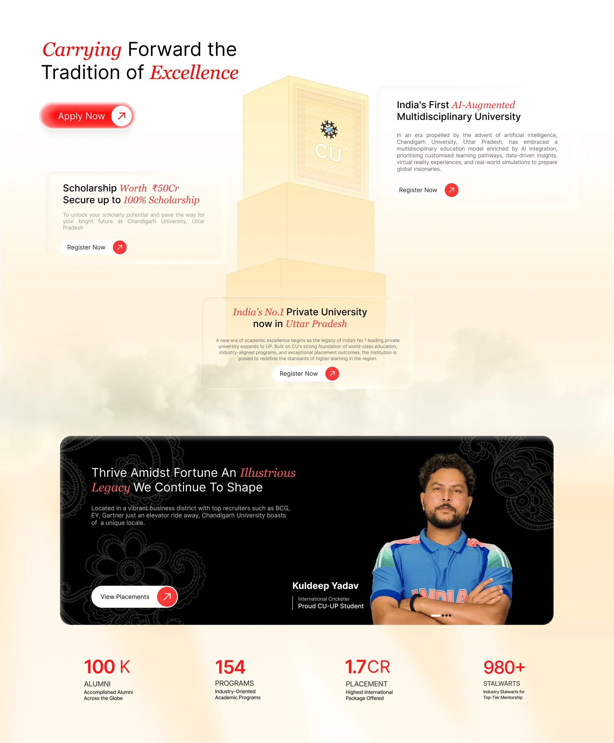
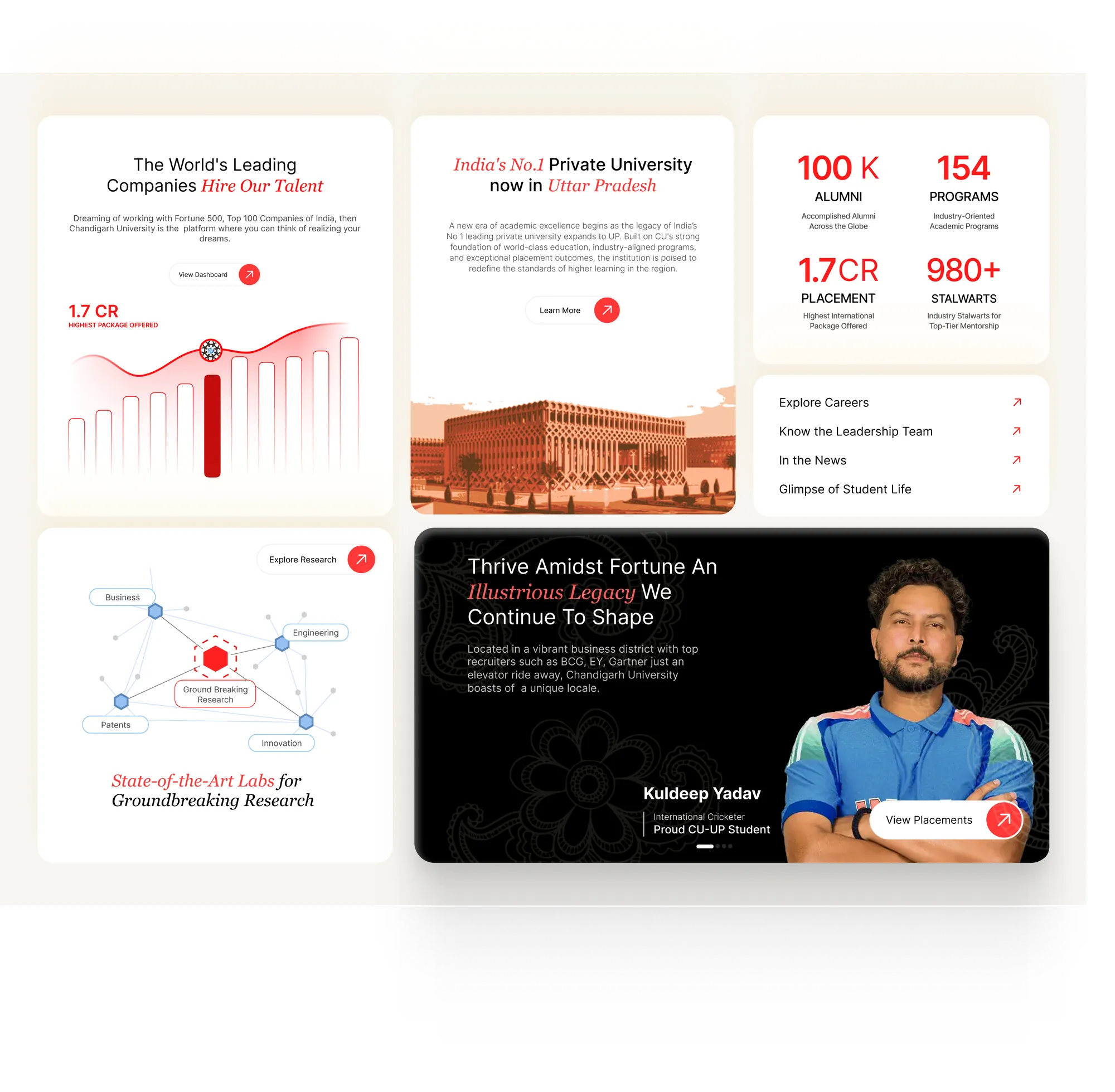
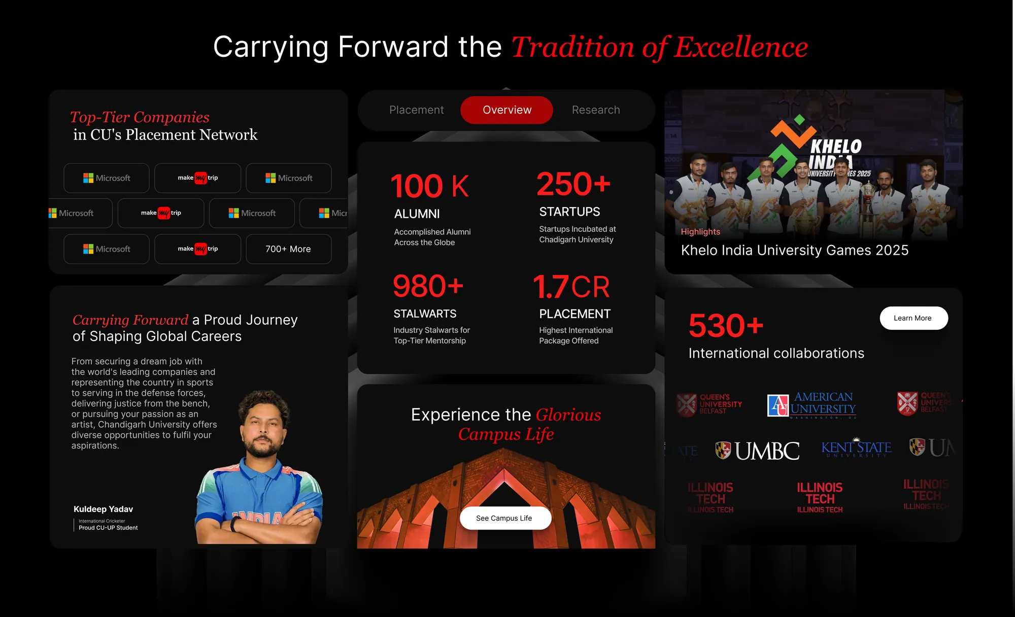
One section, 25 drafts
Tradition, draft by draft
Six months
Two full redesigns, absorbed
April
Day 0 draft approved
Fifteen sections in twelve hours, approved by the chancellor on first sight.
April, week 1
System and architecture
Design system, wireframes, stack and CMS decisions, ready for the build.
May
A team of five
Two frontend engineers (tokens and components; pages), DevOps, and CMS and backend.
April to June
The landing page, every day
Daily reviews, often with two managers asking for opposite things. Most changes were sorted within a day.
June
“Make it a story”
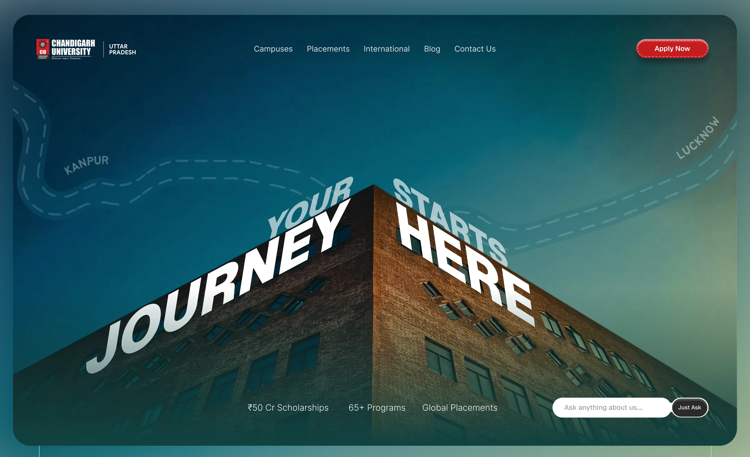
Management wanted the boxy site as a storyline. Grids came off, corners rounded, three sky-high story sections added.
Redesigned in 1 day, live in 2
June
Twenty thousand papers
A research explorer that maps every publication on the landing page without slowing it down.
June to August
From a page to a platform
19 layouts carry 900+ pages: 300+ blog posts, 70+ programmes, 13 schools, on 180+ components.
August
“Too spacious”
Fill it with data, strips and CTAs; move the dashboards inside. We already had that version drawn.
Designed in 2 days, coded in a week
September
CMS, SEO and AWS
Headless CMS, static builds on S3 and CloudFront, heavy film media, search and agent readiness.
31 October
Handover
The university’s own developers take over a CMS, a documented system and a codebase they can extend.
Why it held
Built to be changed
Two months in, management asked for a completely different feel. A site built page by page would have started over. Ours changed its tokens and components: the grid came off, corners rounded, spacing opened up, and three new story sections went in. The whole revamp took a day to design and two to ship on the test site.

Details
Drawn from the campus plan
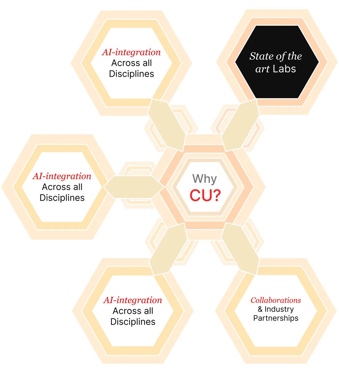
The university is building its future blocks as hexagons. I drew that plan into two elements: nested hexagons that rise behind the tradition section as you scroll, and a “Why CU?” diagram after the master plan, which lived in the design until draft 15.
Choosing with people
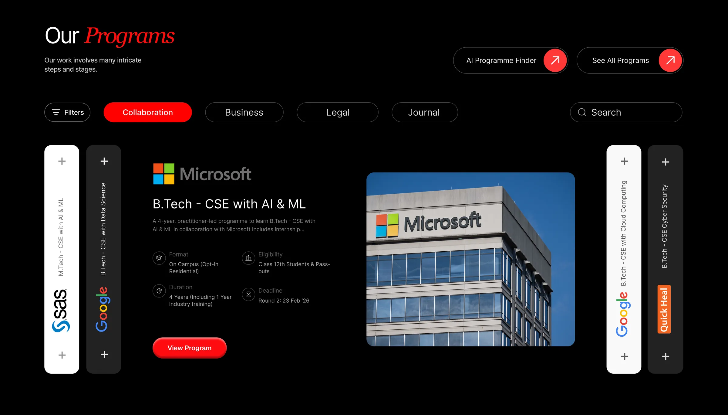
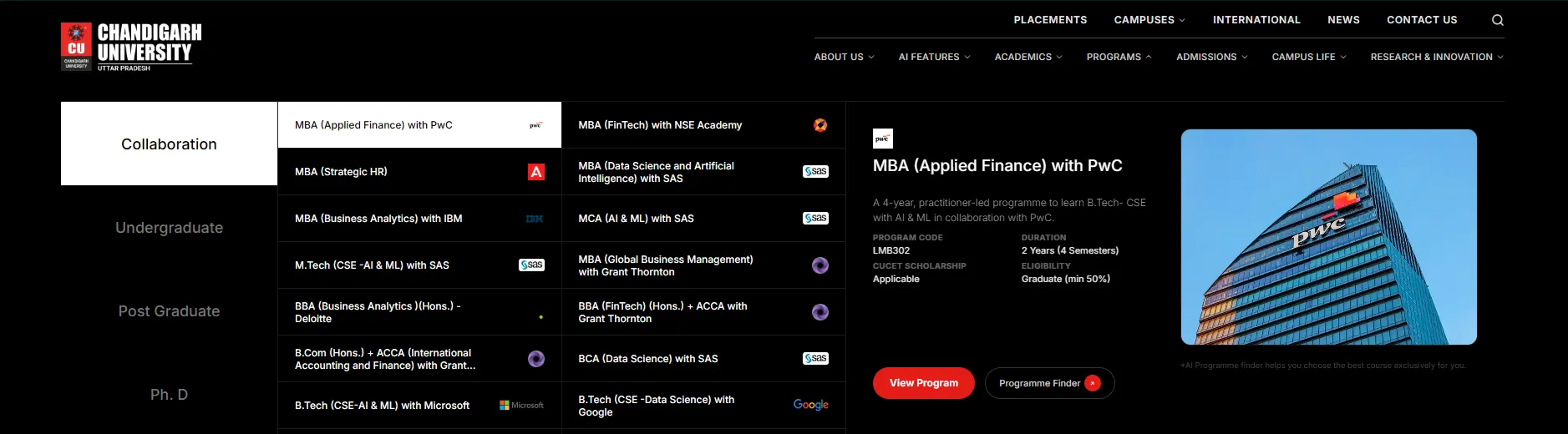
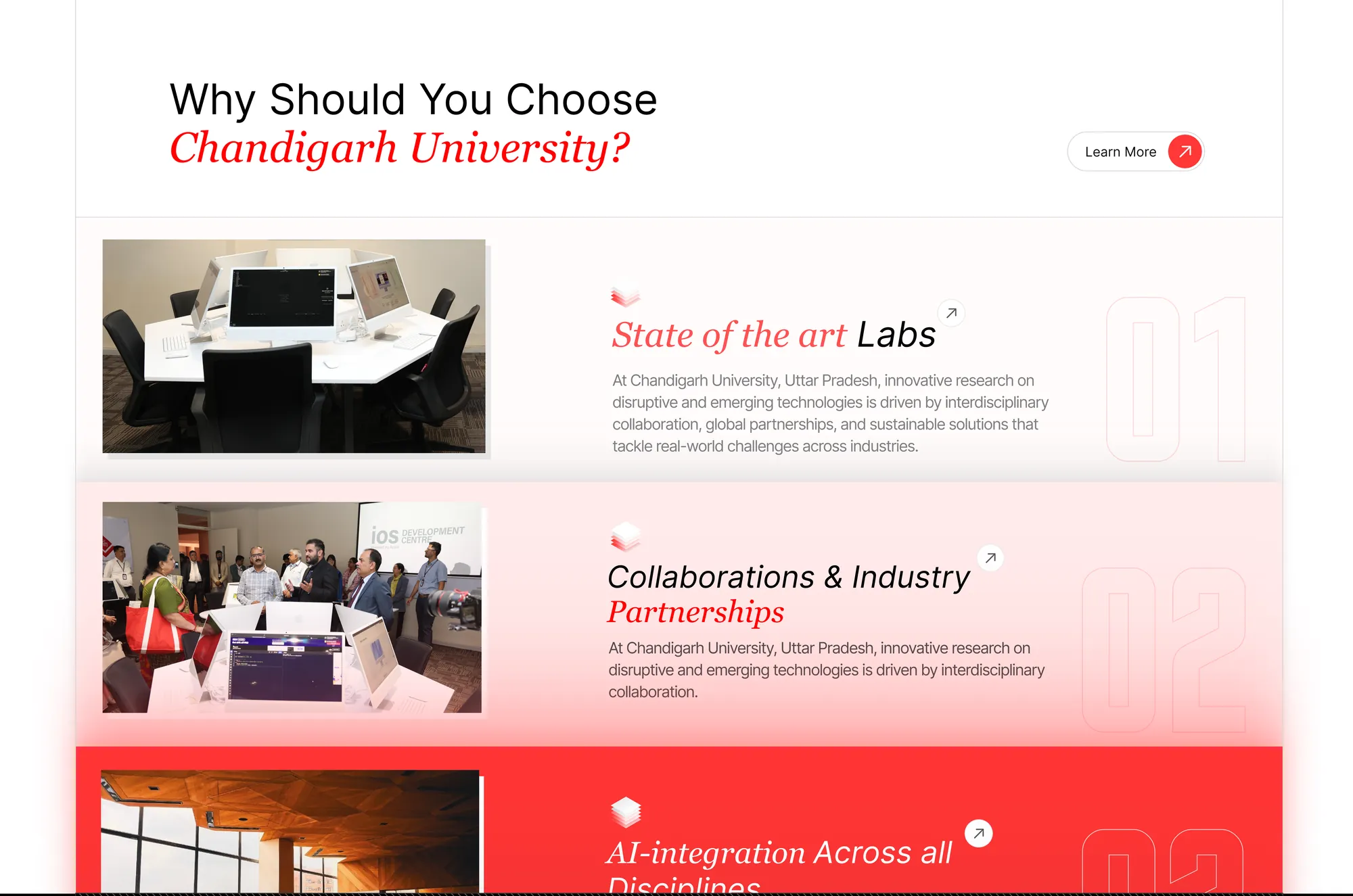
Why CU, in 30 drafts
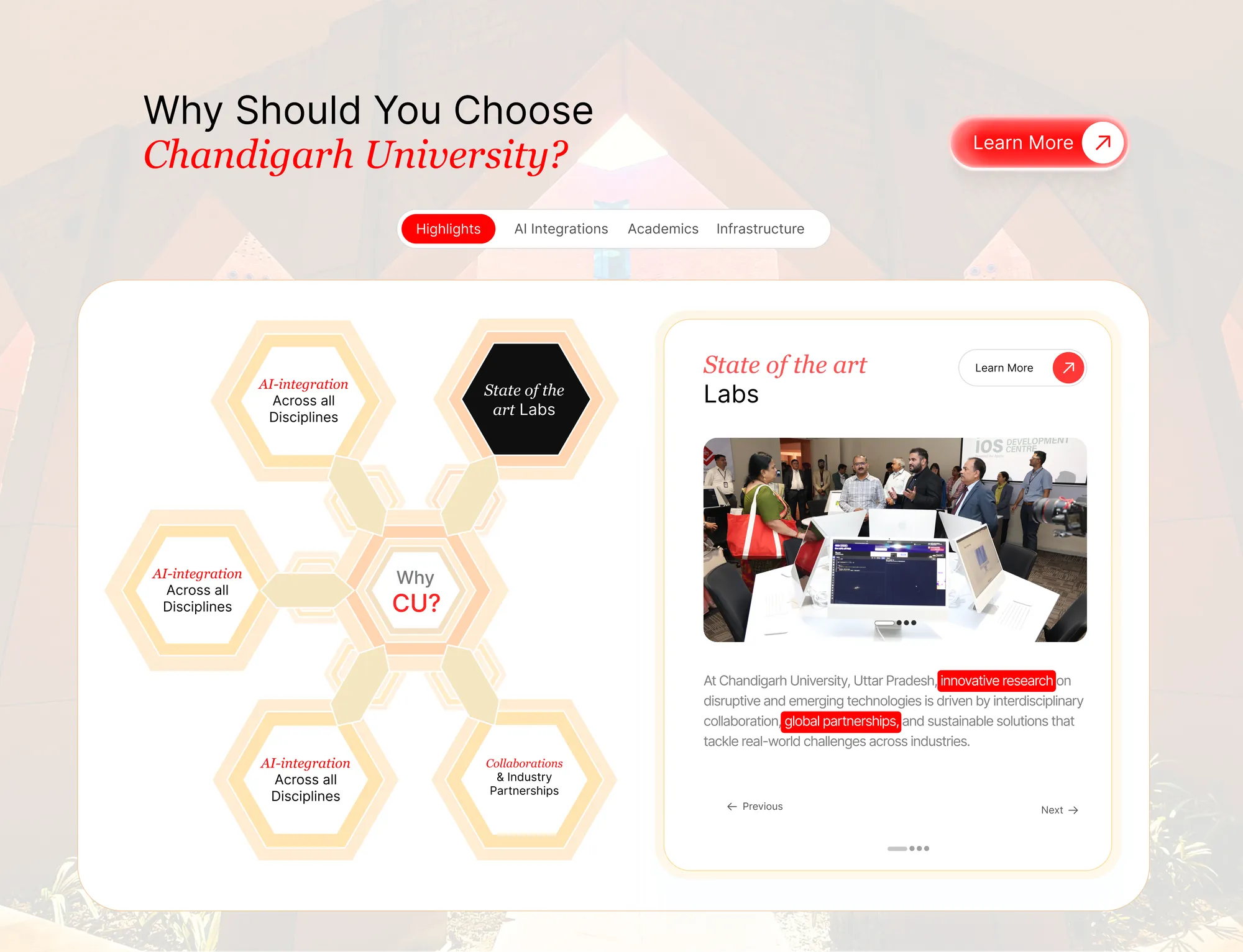
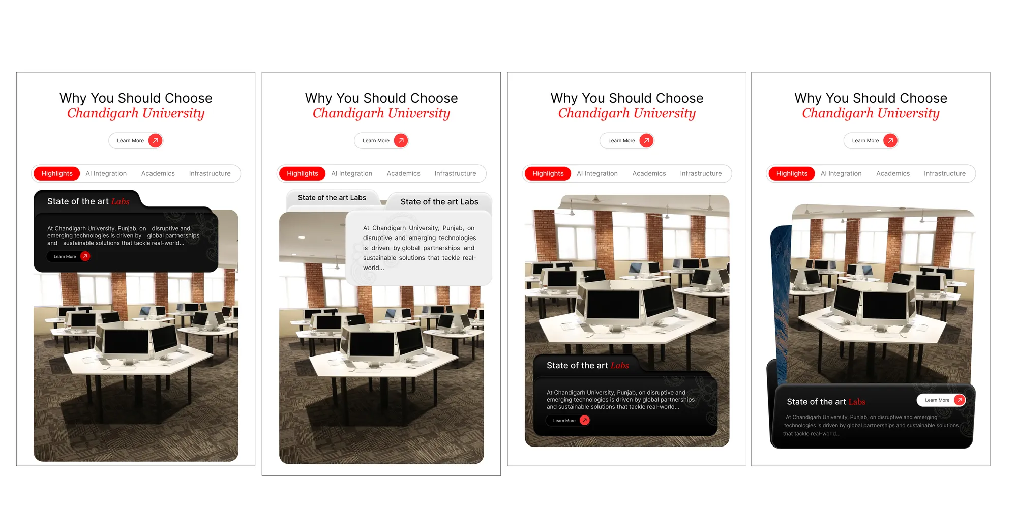
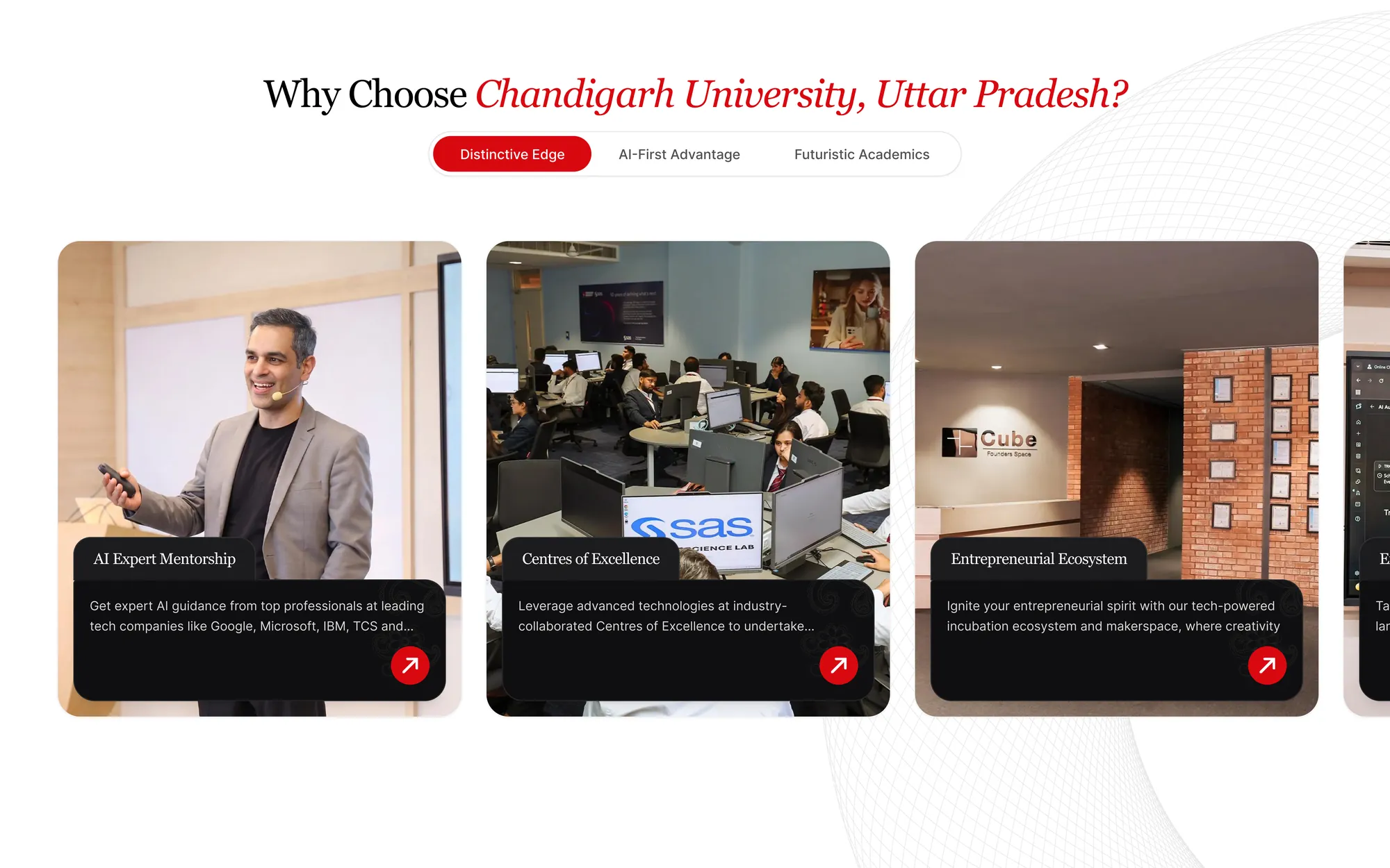
The rooms
Two managers, one card
Many people had a say, and their ideas sometimes clashed over a single card. Each request got one of three answers: fix it now if it was a real flaw (rare); if it questioned how a section worked, explain the reasoning and show variants with the pros and cons of each; and where two asks clashed, find the version that served both. I was the team’s single voice in those rooms, and management came to leave those calls to me.
Research
Twenty thousand papers, one glance
- Publications, 2021–26
- 19,803
- Authors and co-authors
- 40,833
- Journals and proceedings
- 4,258
- Fields across 6 schools
- 35
- Engineering and Technology: 4.2k in 10 fields
- Computing and AI: 4.0k in 3 fields
- Basic Sciences: 3.3k in 4 fields
- Health and Life Sciences: 1.9k in 9 fields
- Pharmaceutical Sciences: 975 in 4 fields
- Management, Law and Humanities: 896 in 5 fields
The shipped research map, rebuilt: each tile a school, sized by what it publishes
The special request
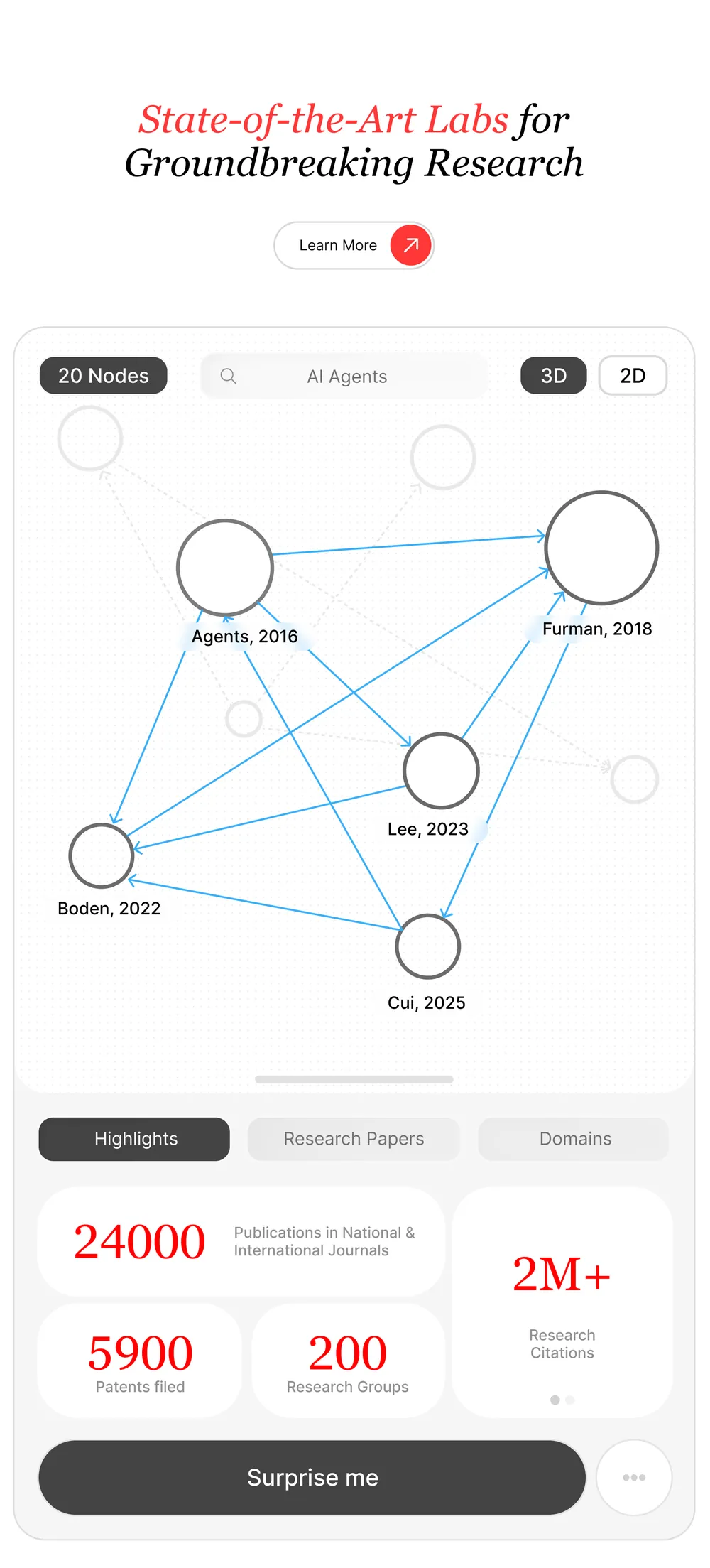
A research map on a landing page
The university wanted its whole research record on the landing page, as a graph you could travel through, not a number. I argued a canvas is hard for a first-time visitor and heavy for a busy page. The first version was a citation graph over every paper, backed by a graph database, that never made the page lag. When management later asked for something simpler, the graph moved inside and the landing page got this map.
Video: A prototype of the placement section: the package chart grows, cards expand into a year-by-year record of recruiters, and a row of placed students slides in

- 900+
- Pages
- 19
- Layouts
- 180+
- Components
- 1M
- Visitors a month, sized for
Architecture
Static, and the CMS still works
Next.js exported to static files on S3 behind CloudFront: no server renders a page for a visitor. Content lives in a headless CMS. Publishing rebuilds the site and invalidates the cache, and the CMS can change words, links and images but never layout. Every field falls back to the site’s own copy, and a build that fails leaves the last good version live.
Performance
The heaviest page, the lightest load
| Measure | CU Lucknow | culko.in | cuchd.in | Masters’ Union |
|---|---|---|---|---|
| DOM elements | 9,139 | 3,393 | 4,212 | 11,190 |
| Requests | 78 | 197 | 235 | 772 |
| Requests per 1k elements | 8.5 | 58.1 | 55.8 | 69.0 |
| Transferred | 3.26 MB | 3.64 MB | 4.09 MB | 73.29 MB |
| JS execution | 0.80 s | 2.99 s | 1.87 s | 3.92 s |
| Main-thread work | 3.19 s | 6.46 s | 5.84 s | 12.21 s |
Controlled Lighthouse benchmark, mobile medians, 17 Sep 2026. culko.in and cuchd.in are the university’s older sites.
- 97
- Lighthouse performance, in the browser
- 78
- PageSpeed mobile, median of 11 runs
- 100
- SEO
- 0
- Third-party requests
Honest numbers
Rich, and still fast
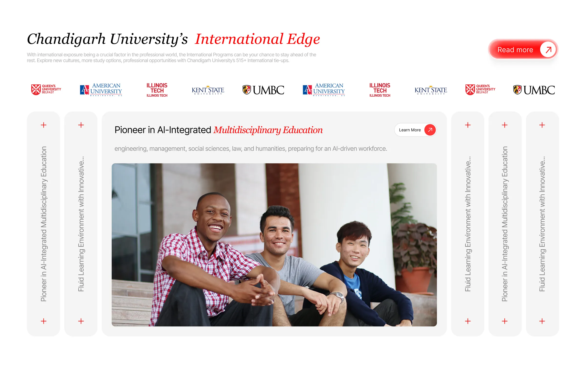
The page carries more than twice the elements of the university’s older sites, with the animation and interaction intact, and still makes a third of their requests and runs a fraction of their JavaScript. We report PageSpeed as a median, not a best run (72 to 87 across eleven), and name the next target: mobile LCP.
Leading
Always two steps ahead
With a team we planned for the worst case: costs, changes and the next redesign, before anyone asked. When a section I had designed came back from the build looking wrong one night, I redesigned it, rewrote it, made it responsive and tested it before morning, so nobody lost a day to it. Six months, hundreds of calls, no missed deadline.
The road not taken
Drawn, loved, not shipped
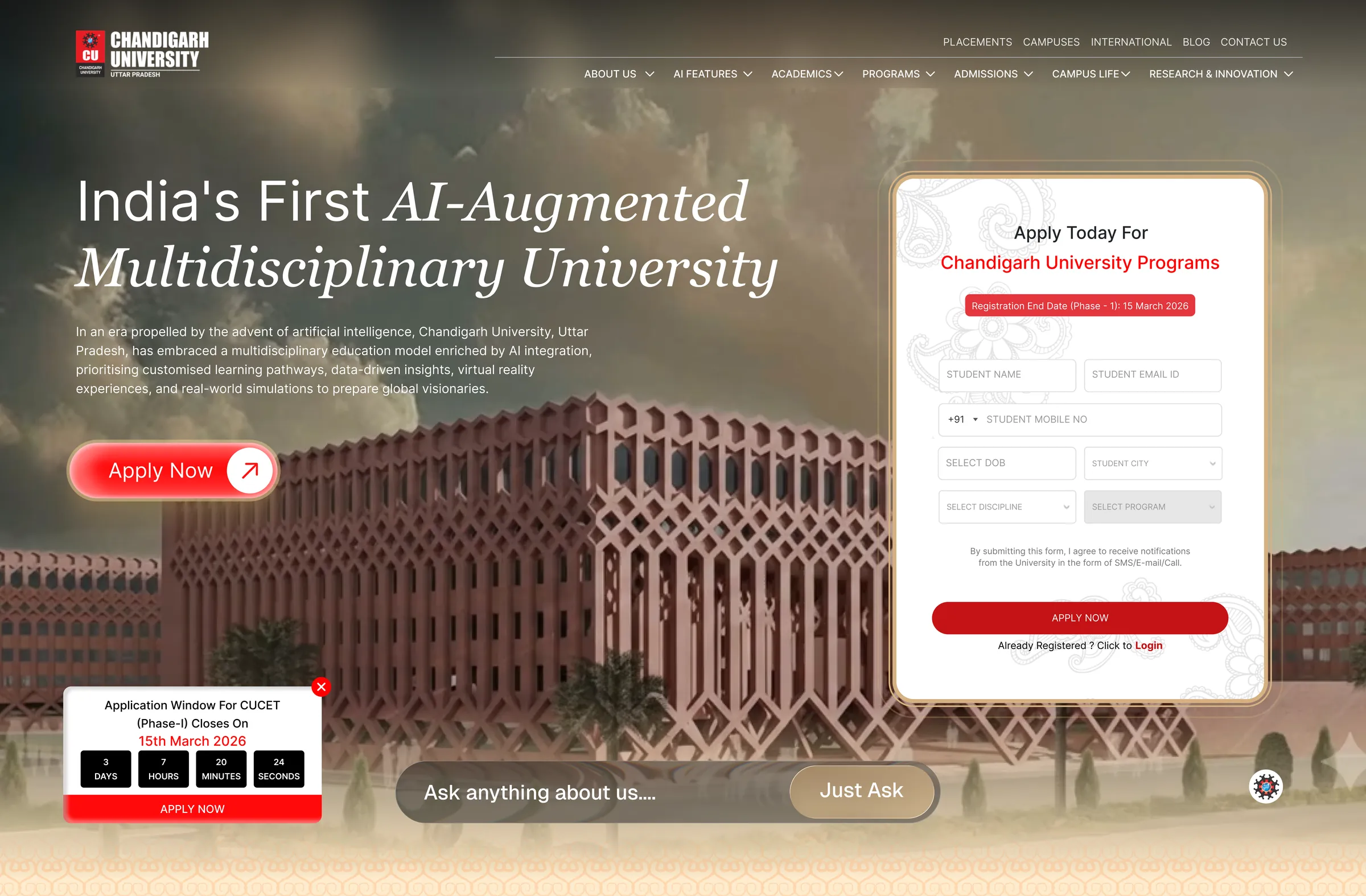
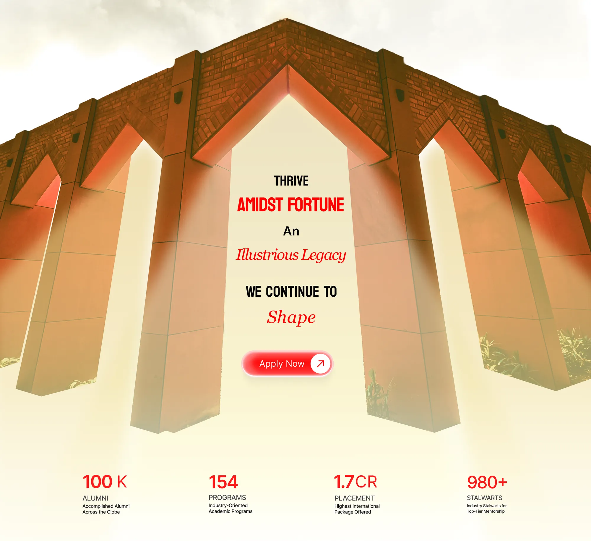
Some designs never reached the code: a hero with the application form beside the headline, and a section framed by the campus arches. They were part of how each decision was made.
Change was the brief. The system was the answer.